Responsive Web
Always Design for Mobile First
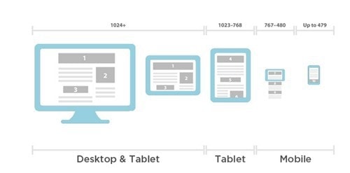
데스크탑,태블릿,노트북,스마트폰등의 다양한 기기가 등장하면서 데스크탑의 화면에 최적화되어 있던 레이아웃을 각 기기의 화면 크기에 맞게 유동적으로 변동해야 하는 필요성이 대두됨내용은 동일하지만 최적화된 레이아웃 렌더링
반응형의 중요성
모바일 시장
더 나은 User eXperience
빠른 페이지 로딩 속도
효율적이고 cost-effective
- 버전을 나누어 유지, 보수할 필요가 없음
종류
1) Responsive Layout (adaptive design)
media query이용해breakpoint적용- 각 component가
px으로 표현됨
2) Fluid Layout
- 페이지의 크기에 따라 레이아웃의 크기도 변경됨
- relative unit인
em또는%으로 표현됨 - time-consuming
- 매번 testing 해야 함
3) Fluid-responsive Layout
responsive과fluid레이아웃의 결합media query의breakpoints이용더 자연스러운 레이아웃 변화
CSS Media Query (Fluid grid system)
@media rule
- width and height of the viewport
- width and height of the device
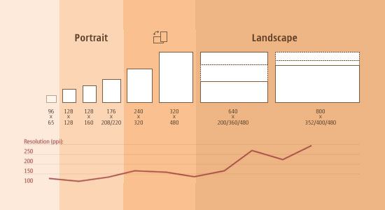
- orientation (landscape / portrait)
- resolution
Media Types
| Value | Description |
|---|---|
| all | Default. Used for all media type devices |
| Used for printers | |
| screen | Used for computer screens, tablets, smart-phones etc. |
| speech | Used for screenreaders that “reads” the page out loud |
Media Features
| Value | Description |
|---|---|
| max-height | The maximum height of the display area, such as a browser window |
| min-width | The minimum width of the display area, such as a browser window |
css
1 | @media not|only mediatype and (mediafeature and|or|not mediafeature) { |
scss
1 | // Media Query Mixins |
html
1 | <link rel="stylesheet" media="screen and (min-width: 900px)" href="widescreen.css"> |


1 | /* Smartphones (portrait and landscape) ----------- */ |
Reference
https://css-tricks.com/a-complete-guide-to-css-media-queries/